(Don’t) Let there be Light
It’s no big secret that the design of Oddwords isn’t exactly set in stone. Through its little more than three years of existence, it underwent several heavy changes, but there was one thing I always held very important, when designing the site: being lightweight. For this reason I opted to more or less ban JavaScript on my website, use WebP instead of JPG/PNG where applicable and keep imported fonts to a minimum (nowadays I only import Open Sans, which I use everywhere.)
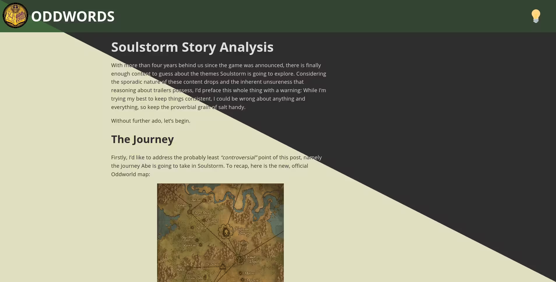
Today, however, I’ve opted to deviate a bit from my principles and introduce some JS to the website. The reason for this is simple: If you take a glance in the top right corner of the page’s header, you’ll most likely see a small lightbulb. Click on it and the page turns from its usual warm yellow colors to a grayish appearance. Click on it again and the process is reversed. And as an added bonus, your browser will remember which one you settled on, so no need to keep switching it on or off.
As an added bonus, even if your browser doesn’t support JavaScript or you do not trust my terrifying ~30 lines long script (which you can find here) and have disabled it, the website will simply default to the original light design and won’t even display that pesky lightbulb which would just take up space uselessly without the code behind it.
Tech details
This was achieved by refactoring the page’s CSS files to use variables instead of using hardcoded values for colors. The colorscheme.css stylesheet simply contains the values for these variables and the JS code just swaps between them as necessary. All of this happens under the hood, all the user sees is a (hopefully) snappy transition between the two.

