The Many Faces of Oddwords
The website is slowly nearing its first anniversary, so I figured I would like make a page that showcases just how differently the page used to look in the past. To do this, I took a screenshot of the frontpage and the very first article every time the page’s design undervent a major change. These can be seen below:
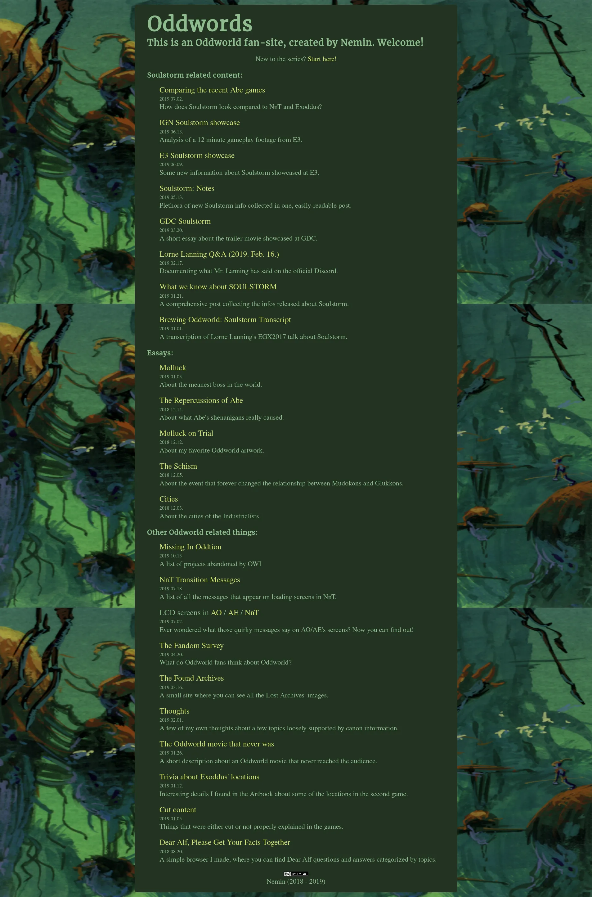
Old-style Frontpages
These were my very first attempts at organizing the articles on my site. Even through they’re quite flawed, I’m pretty fond of the second design which - with some modifications of course - could become a nice frontpage for a site.
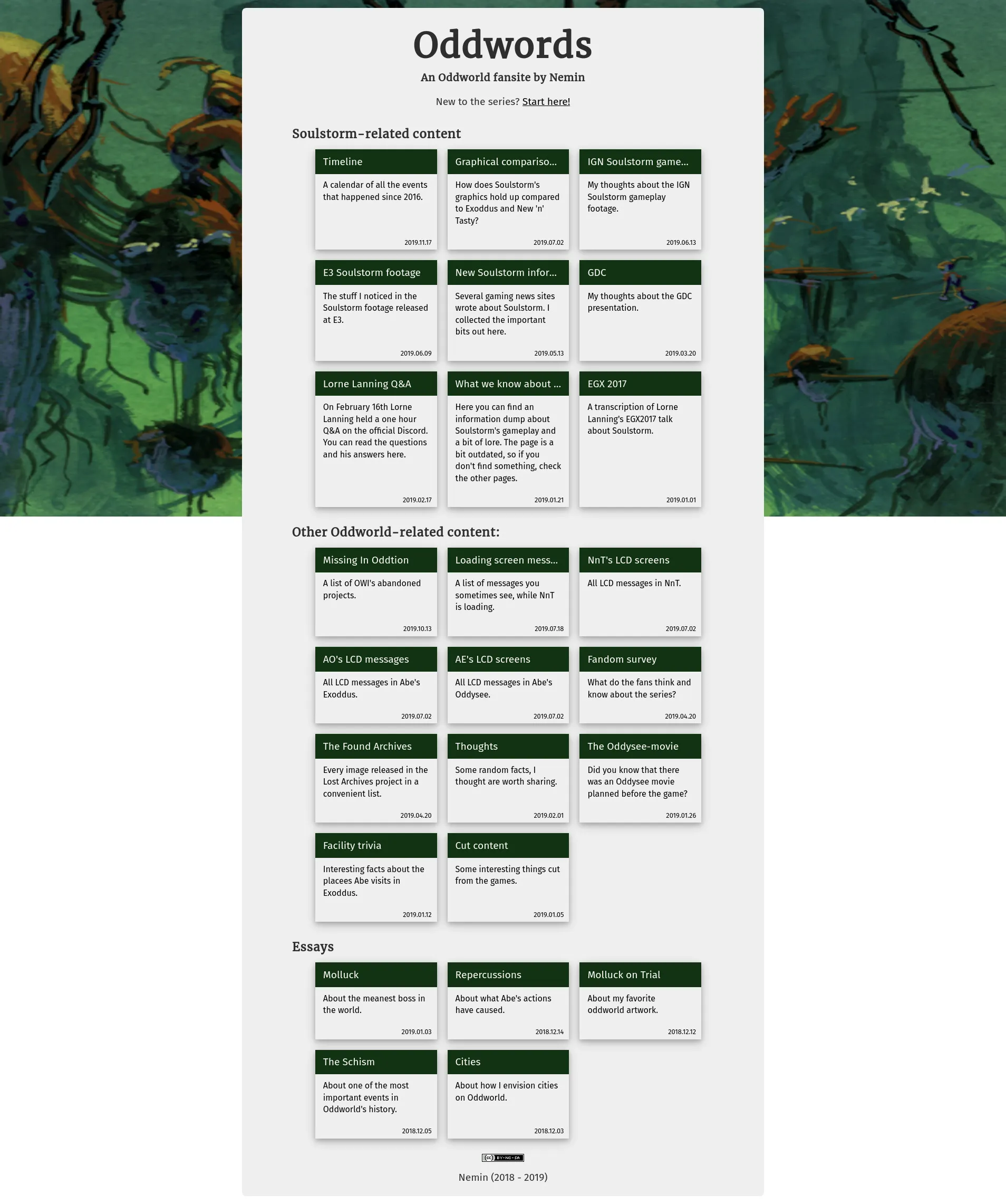
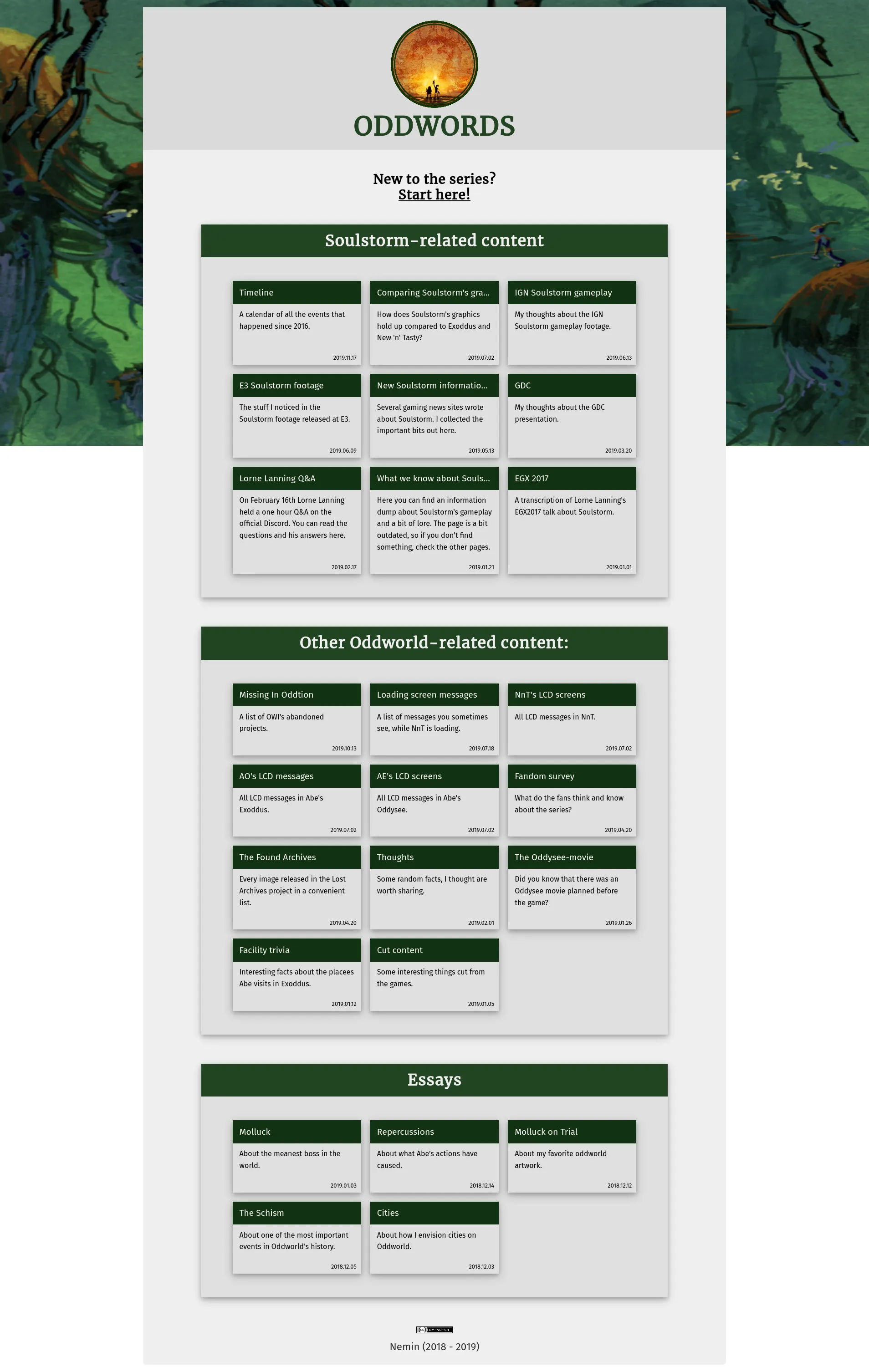
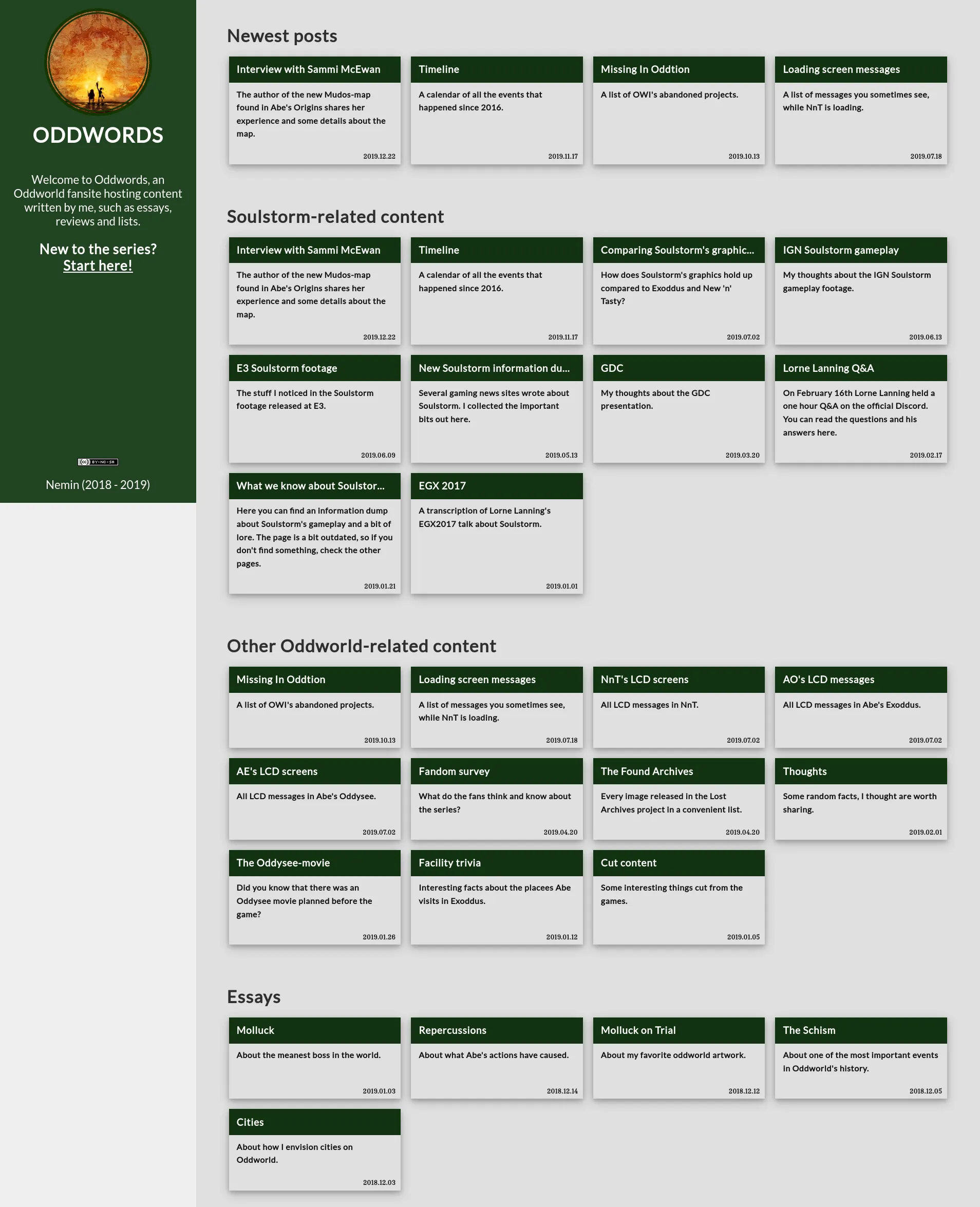
New-style Frontpages
Of course eventually I realized I would like to present these articles in a more appealing fashion, so I first opted to use a list with differently colored titles and then did away with that and instead chose to use a grid of more traditional “blog-post” like rectangles.
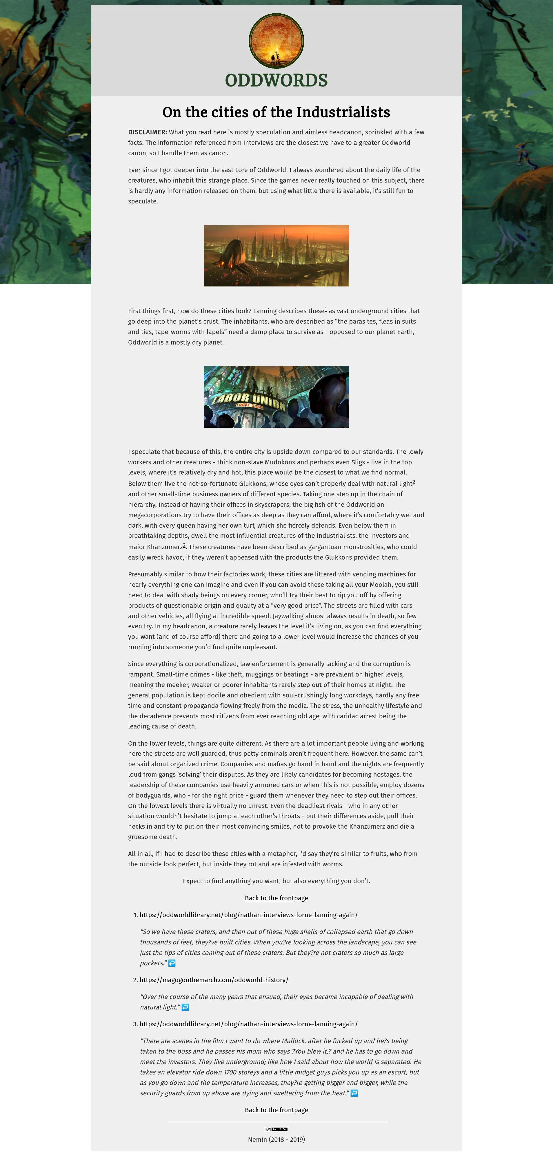
Cities
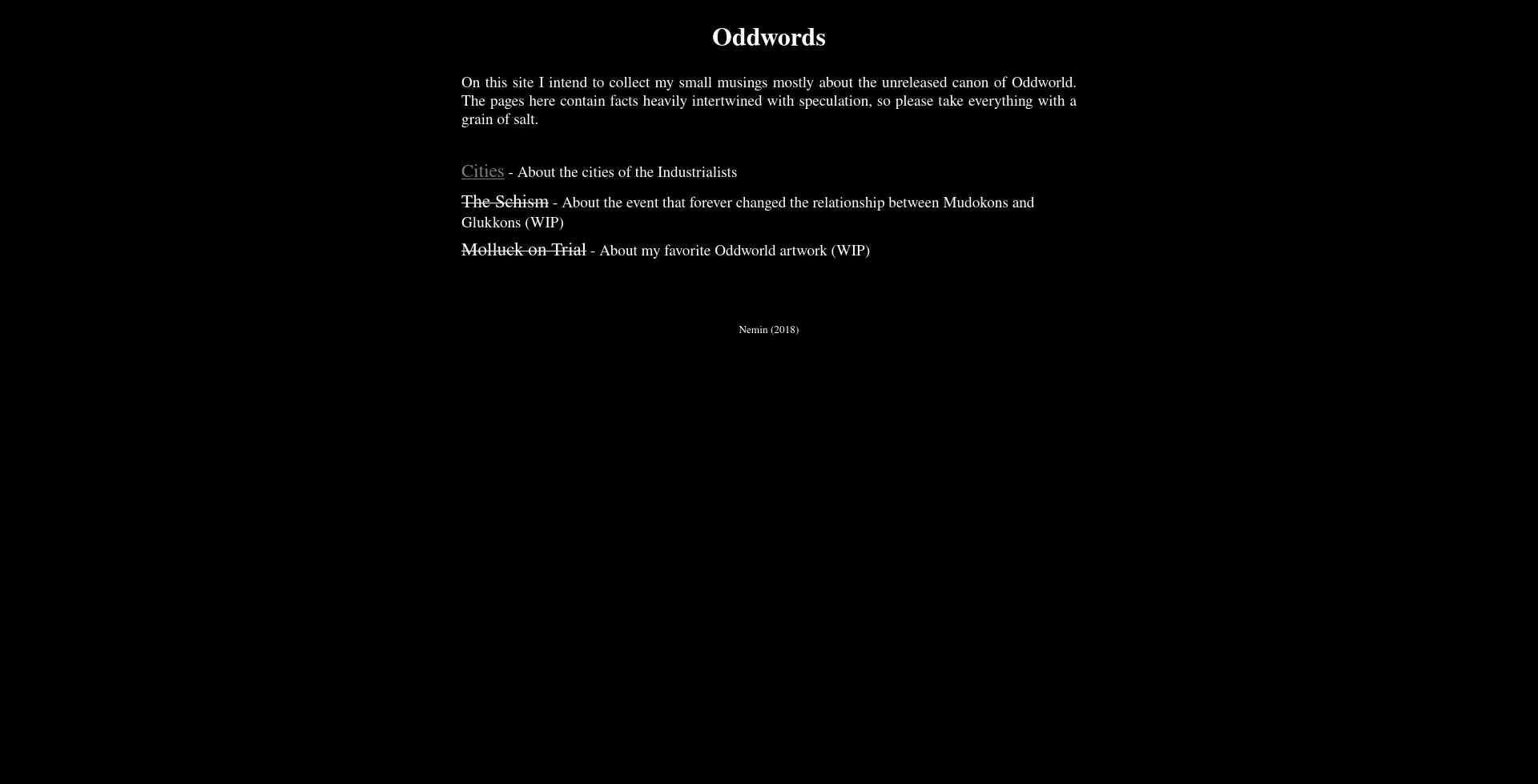
What you see below is the very first Oddwords-article I’ve written. It was created even before I had the name “Oddwords” in mind. I started the website after some encouragement from a friend, but I had absolutely no idea what I was doing. My first “design”, if we can even call it that, was a simple white-on-black text, with minor formatting. The page was pretty hard to read and kind of soulless.
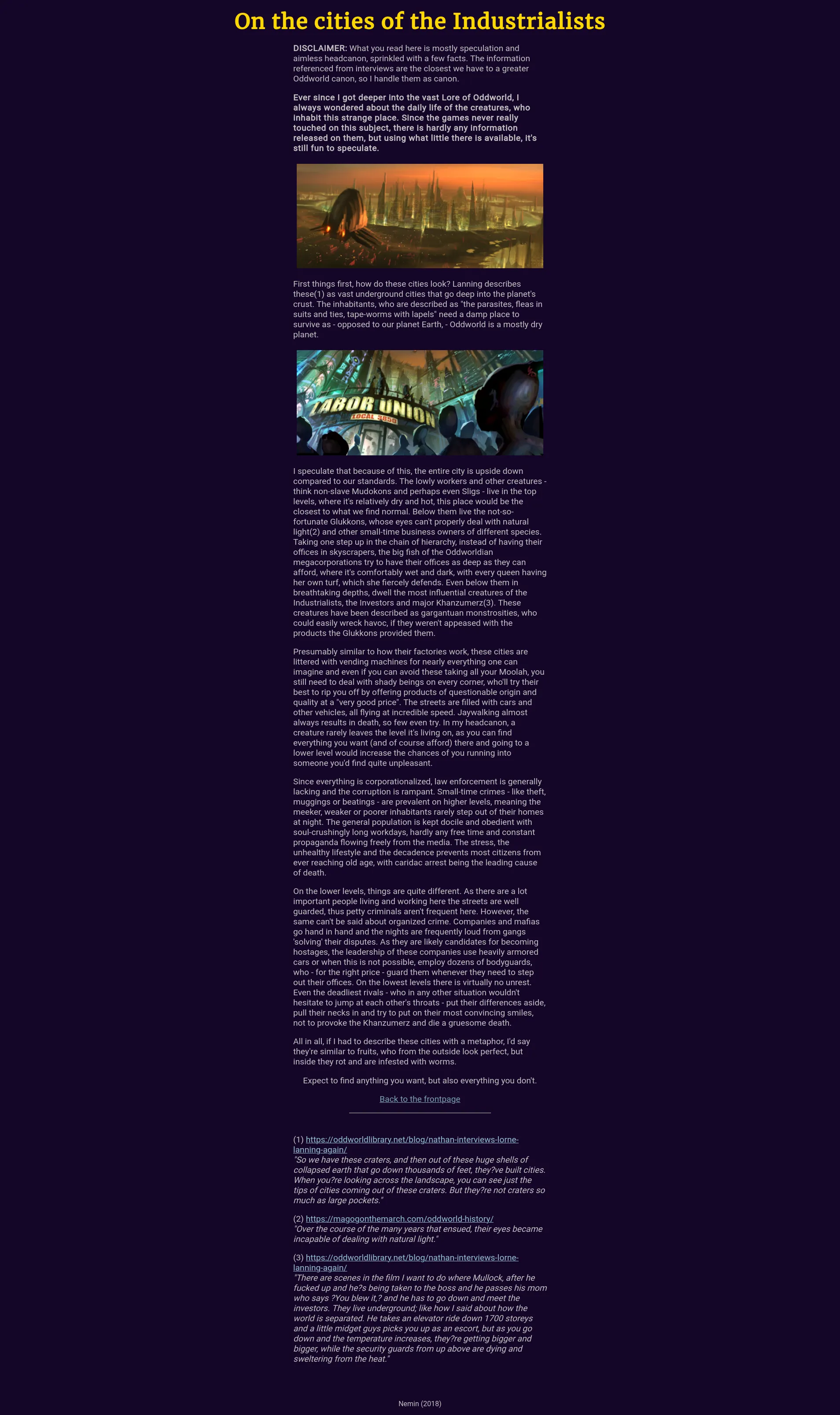
I later attempted to alleviate this by using justified text and less harsh colors, but I wasn’t entirely convinced with the results, nor were the people I showed the site to.
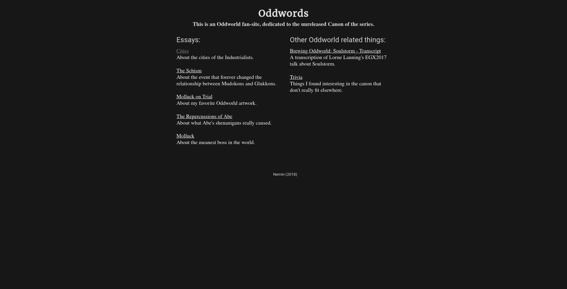
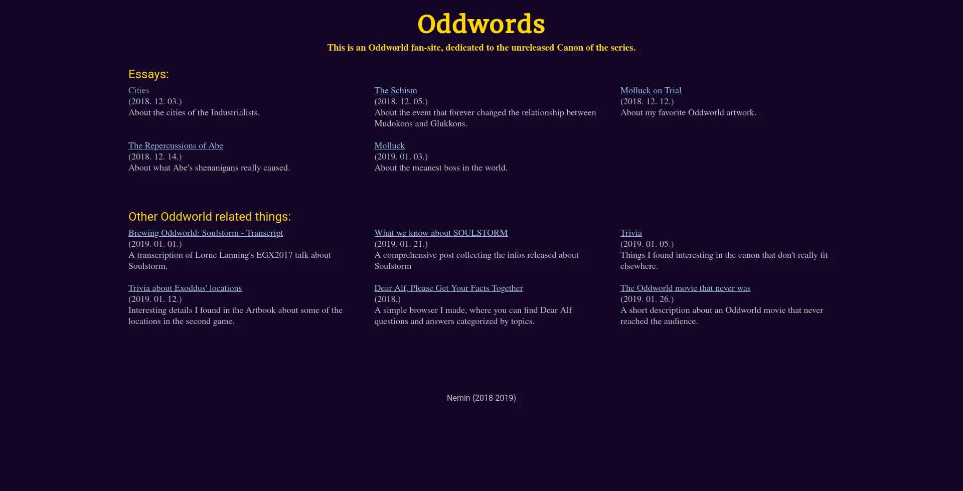
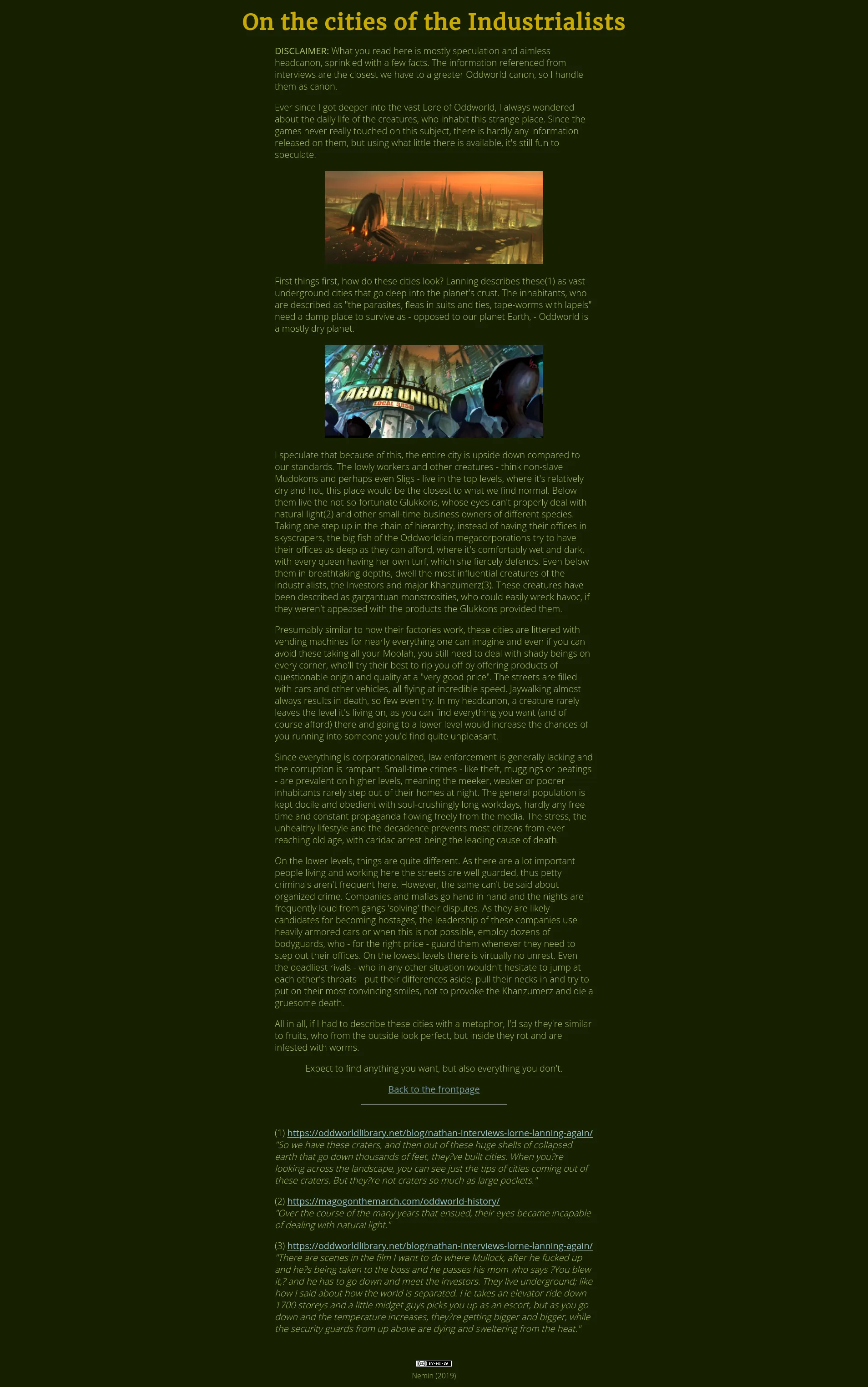
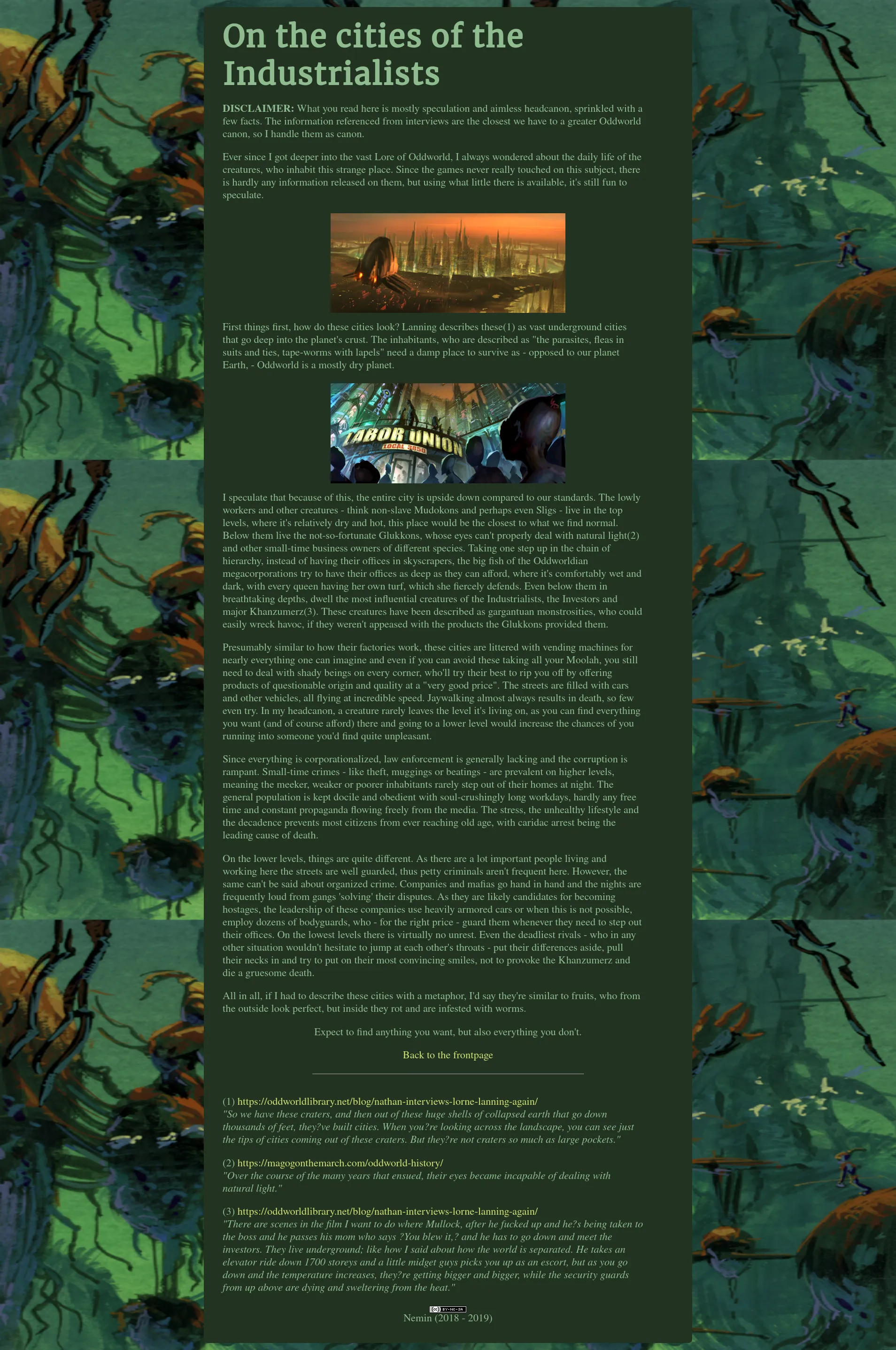
To make the site a bit more unique I started experimenting with wild color-schemes, like yellow on purple (modelled after an early version of TOE), but while this gave the site character, it was still quite hard to read. The later two green on green designs didn’t exactly help either.
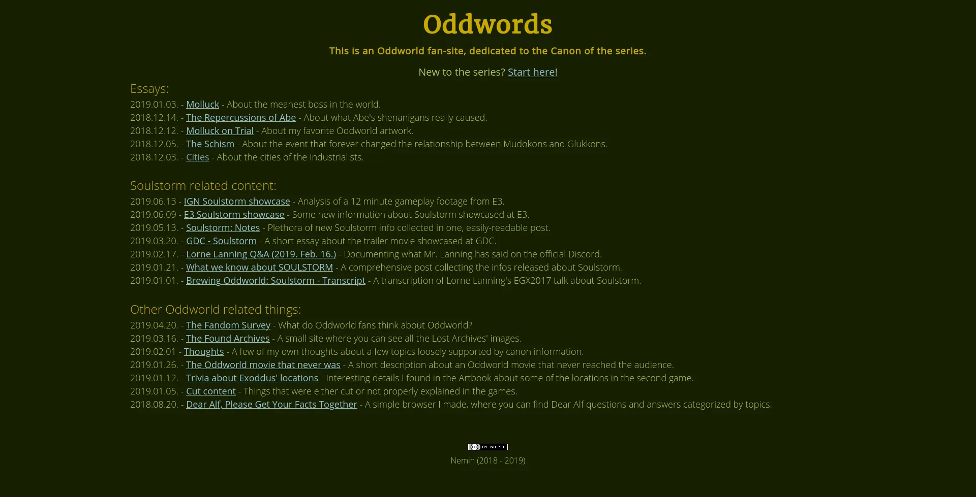
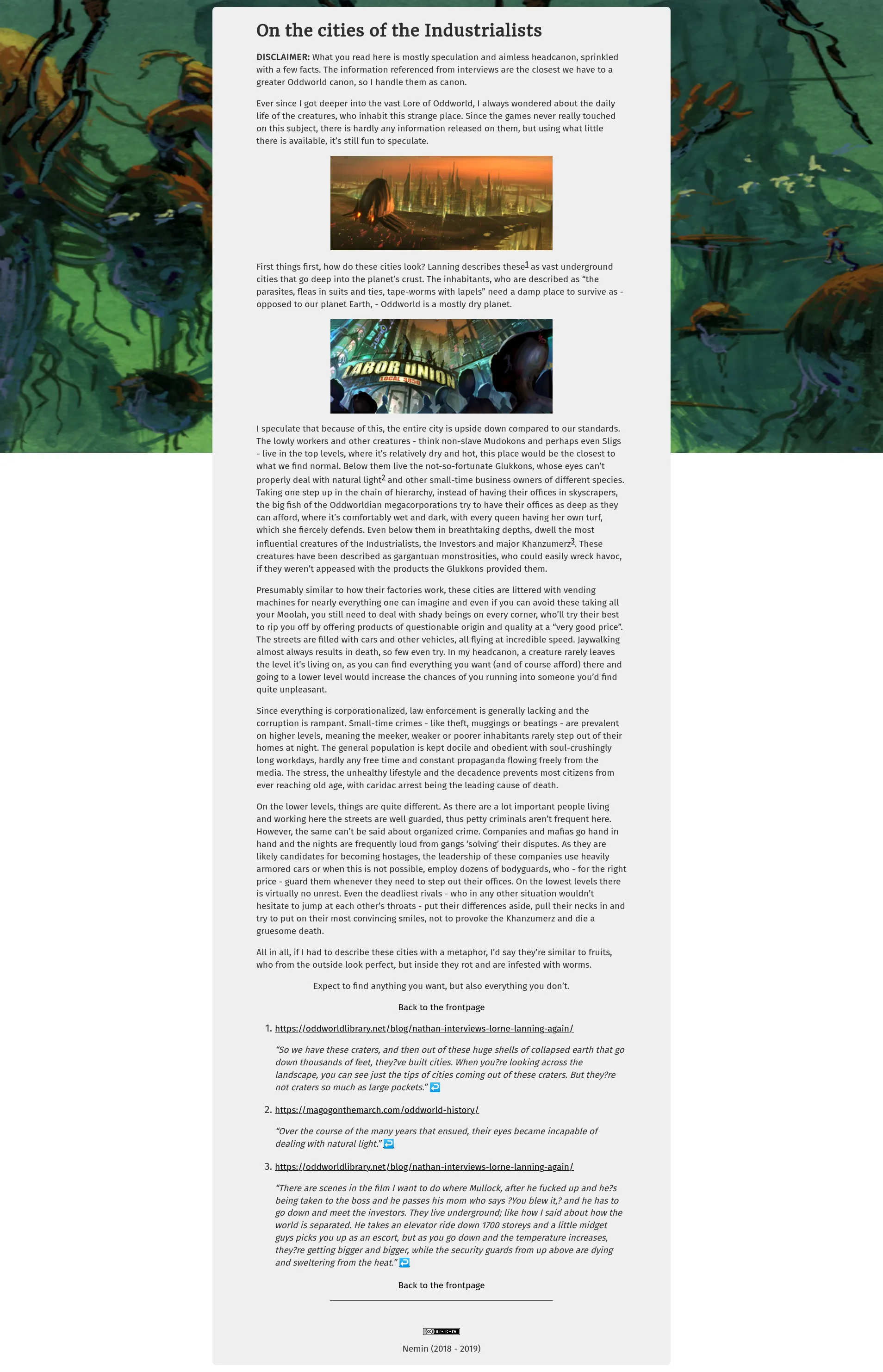
I ultimately realized less is sometimes more so I started utilzing a simple dirty-white background and almost-black font, which considerably improved readability.
    body {
        background-color: black;
    }

    h1 {
        text-align: center;
        margin-top: 2ch;
        margin-bottom: 1.5ch;
        color: white;
        font-size: 4ch;
        font-weight: bold;
    }

    p {
        width: 80ch;
        margin: auto;
        margin-bottom: 2ch;
        color: white;
        font-size: larger;
    }

    p.centered {
        text-align: center;
    }

    hr {
        width: 40ch;
        margin-top: 2ch;
        margin-bottom: 2ch;
    }

    img {
        width: 60ch;
        display: block;
        margin-left: auto;
        margin-right: auto;
        margin-bottom: 4ch;
        margin-top: 4ch;
    }
The original CSS stylesheet of cities.html, only around 40 lines in size compared to the current 250-300.
Thanks for sticking with Oddwords and I hope I’ll see you in 2020!